Progress bar
Color
| Element | Property | Color token |
|---|---|---|
| Label | text color | $text-primary |
| Helper text | text color | $text-helper |
| Track | background | $border-subtle |
| Bar: active | background | $border-interactive |
| Bar: success | background | $support-success |
| Icon: success | fill | $support-success |
| Bar: error | background | $support-error |
| Icon: error | fill | $support-error |

Status colors

Progress bar colors for light themes

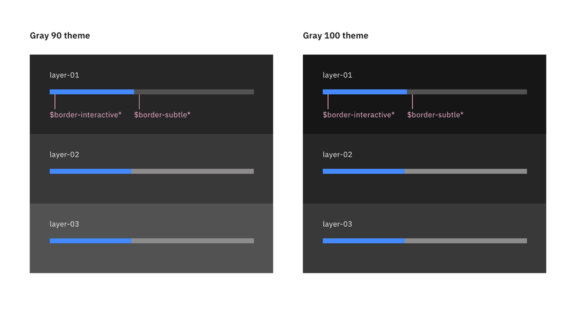
Progress bar colors for dark themes
Typography
| Element | Font-size (px/rem) | Font-weight | Type token |
|---|---|---|---|
| Label | 14px / 0.875rem | Regular / 400 | $label-01 |
| Helper text | 12px / 0.75rem | Regular / 400 | $helper-text-01 |
Structure
Depending on the use case, progress bar can have three ways for text alignment: default, inline, and indented. The width of a progress bar can be customized appropriately for its context. The minimum width of a progress bar is 48px and keep its width to a maximum of six columns when possible.
| Element | Property | px / rem | Spacing token |
|---|---|---|---|
| Label (top aligned) | padding-bottom | 8 / 0.5 | $spacing-03 |
| Helper text | padding-top | 8 / 0.5 | $spacing-03 |
| Label (left aligned) | padding-right | 16 / 1 | $spacing-05 |

Structure and spacing measurements the progress bar | px / rem

Structure and spacing measurements the progress bar with an icon | px / rem
Sizes
There are two sizes for the progress bar height, big and small.
| Size | Height px / rem |
|---|---|
| Big | 8 / 0.5 |
| Small | 4 / 0.25 |
